


 Agency Program
 Affiliate Program
In recent years, the significance of data within business strategies has increased significantly. The majority of companies now base their strategic maneuvers upon meticulously curated datasets. As a consequence, data analysts and scientists are trying to undertake the task of analyzing and interpreting those datasets. Nevertheless, even with their sophisticated knowledge of data interpretation, they may encounter difficulties when trying to impart that understanding to the decision-makers. To solve this problem, applying correct data visualization techniques that convert numbers into compelling narratives can be very beneficial since good visuals provide more efficient ways to analyze data than descriptive statistics. They help to understand distributions, correlations, and detection of outliers.
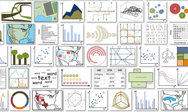
Figure:https://seas.harvard.edu/news/2013/10/what-makes-data-visualization-memorable
According to Harvard Business School (2019), data visualization is the process of creating graphical representations of information. In this process, it is crucial to choose which visualization type should be applied since tmany data visualization techniques can show the relationships in data and each with its suitability contingent upon the nature of the data. While selecting the visualization technique, the number of variables that will be demonstrated in visual and the metric that should be analyzed (correlation, distribution, network, etc.) should be decided. In this article, I endeavor to explain several such techniques, expounding upon their respective advantages and drawbacks.
1- Scatter Plot

Figure: https://www.w3schools.com/python/python_ml_scatterplot.asp
Scatter plots allow the user to explain the relationship between two continuous variables. Each point on the graph represents a single data point. Scatter plots are commonly used to understand the correlation between two variables, showing the pattern in the data and demonstrating the trend and identification of outliers.
Nonetheless, they are constrained by certain limitations. Firstly, scatter plots are limited to two variables, you may want to choose a different technique if you want to increase the depth of your analysis. Another disadvantage of scatter plots is, that they are not suitable for categorical variables, they can be used only for continuous variables.
You can use Matplotlib or Seaborn to draw a scatter plot in Python.
2- Bar Chart
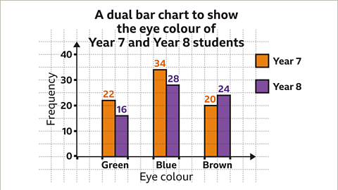
Figure: https://www.bbc.co.uk/bitesize/articles/zy7xs82
Bar charts are very easy to understand and straightforward. It is one of the best data visualization techniques to compare the values in a dataset. However, they can be very manipulative if the scale of the graph is not correctly customized. Interpreting inaccurately scaled bar graphs can inadvertently distort perceptions and lead to inaccurate analysis. Also, it has limitations if your data has several categories. In those cases, the congestion can be seen in the chart and it will be hard to interpret.
Bar charts are also can be used vertically and horizontally. You can select the way you want to show your data depending on your case.
Bar charts can be created with Matplotlib or [Seaborn](https://seaborn.pydata.org/archive/0.11/generated/seaborn.barplot.html#:~:text=barplot,-seaborn.&text=Show point estimates and confidence,that estimate using error bars.) in Python.
3- Histogram
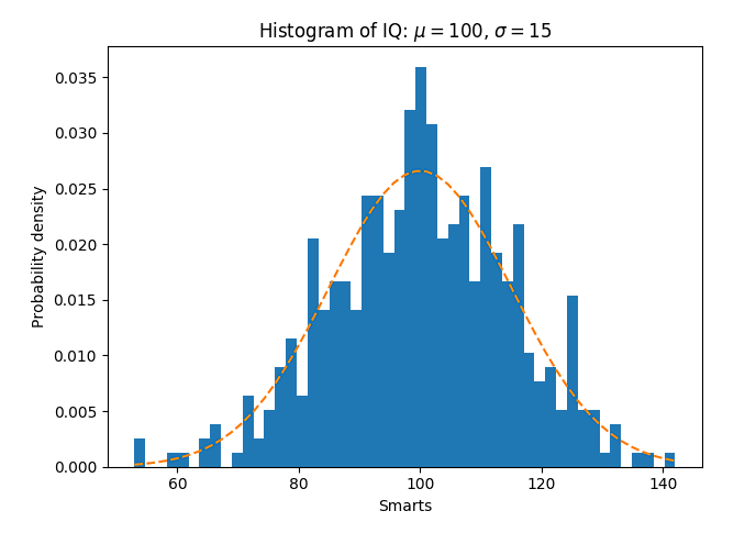
Figure: https://matplotlib.org/3.1.1/gallery/statistics/histogram_features.html
Histograms are generally used to demonstrate the distribution of numerical data. It helps to exhibit the distribution concentration of values in the dataset. They also provide information about the skewness, central tendency, and variability of the dataset. Similar to bar charts, histograms provide ease of interpretation. Nevertheless, histograms should be configured appropriately in terms of bin width, proper labeling, and sample sizes. Otherwise, they can induce wrong assumptions about the dataset.
You can use Matplotlib and Seaborn to create your histograms in Python.
4- Pie Chart
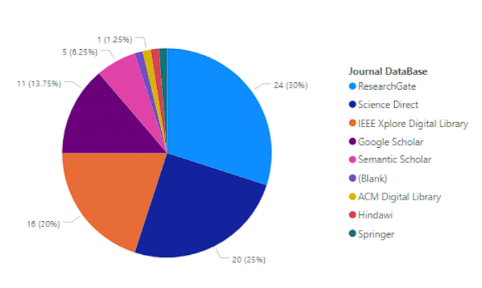
Pie charts are the most common and basic visualization method to represent categorical data. It contains the relative proportions of different categories within a dataset. One advantage of pie charts is their simplicity, they are very easy to understand and suitable to compare if your dataset does not have several categories. Yet, if your dataset has several categories, the chart may become cluttered and it will not be suitable to use. Additionally, interpreting pie charts can be challenging when the differences in segment sizes are minimal, as it may be difficult for the audience to discern these differences.
This pie chart documentation from Matplotlib can guide you to create a pie chart with Python.
5- Box and Whisker Plot
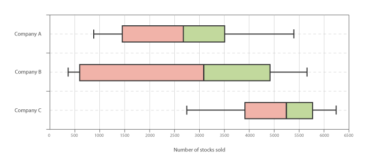
Figure: https://datavizcatalogue.com/methods/box_plot.html
Box and whisker plots, commonly referred to as box plots, are a kind of data visualization used to depict the distribution of numerical data and to identify outliers. Unlike some other visualization techniques, such as bar charts or line graphs, box plots directly provide statistical information such as interquartile ranges(IQR), median, and outliers. Still, box plots have some limitations. For instance, they may not be suitable for small sample sizes and they may not be as intuitive or familiar to non-technical audiences compared to other types of plots like bar charts or line graphs.
In Python, you can use Seaborn or Matplotlib libraries to create a box and whisker plot.
6- Heat Map
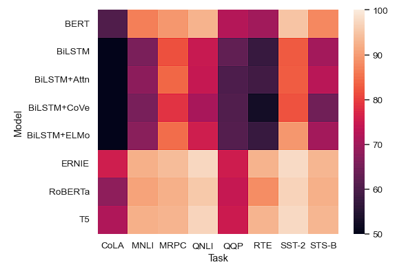
Figure: https://seaborn.pydata.org/generated/seaborn.heatmap.html
Heat maps are used to visualize the relationship between two variables by using the variations of colors. They are very suitable to identify patterns and outliers in the dataset. Although they are easy to interpret, they need to be configured appropriately in terms of color scale, otherwise, it may not be easy to understand the patterns between variables for the audience.
You can create heatmaps with Sklearn or Matplotlib in Python.
7- Correlation Matrix
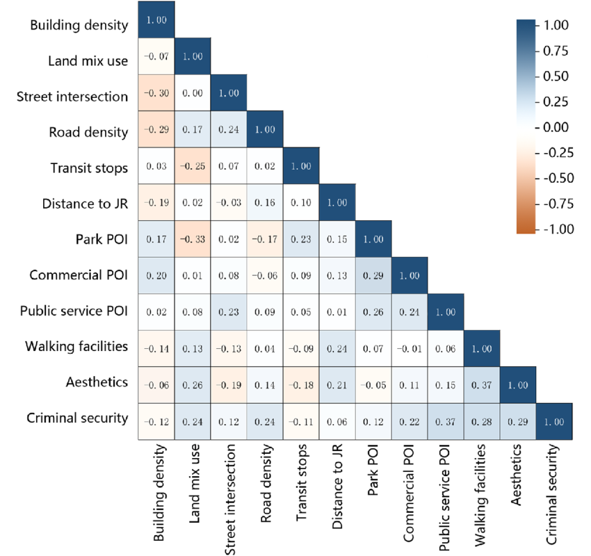
Figure: https://www.researchgate.net/figure/Pearson-correlation-matrix-analysis-result_fig1_372854171
A square symmetrical matrix that lists the correlations between two variables in a dataset is called a correlation matrix. In statistics and data analysis, a correlation matrix is an essential tool to figure out how variables relate to one another. Correlation score 1 indicates a perfect positive correlation, correlation score -1 indicates a perfect negative correlation, and correlation score 0 demonstrates no correlation. It is imperative to recognize that while examining correlation matrices, assumptions of linearity for each relationship within the dataset should not be presumed. Furthermore, it is crucial to distinguish between correlation and causation.
This documentation provides a complete process of producing correlation matrices using Matplotlib and Seaborn in Python.
8- Treemaps
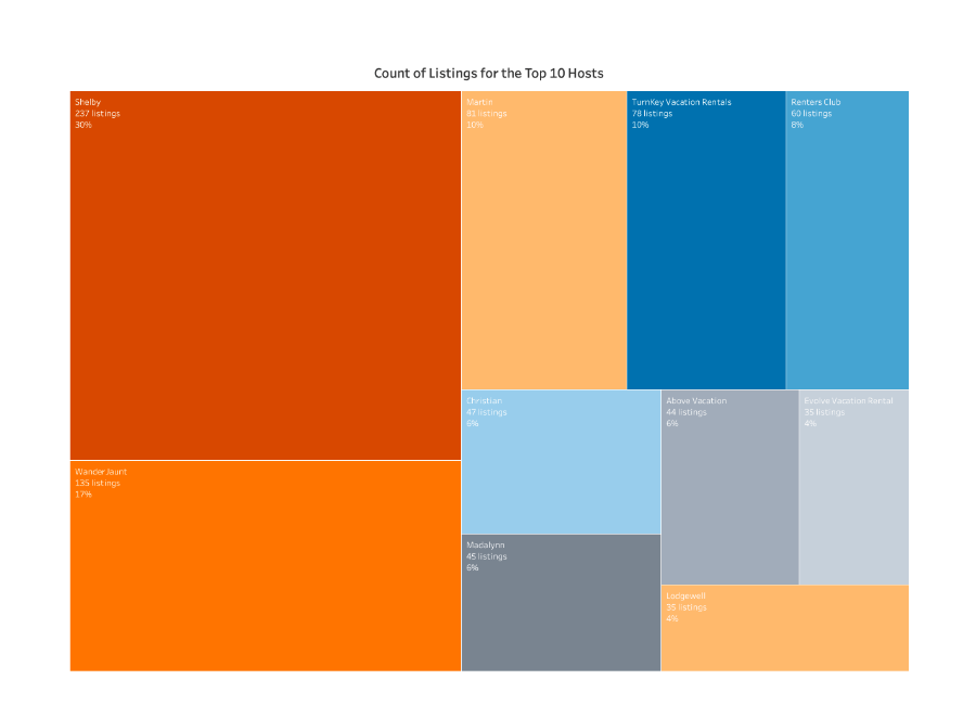
Figure: https://www.tableau.com/data-insights/reference-library/visual-analytics/charts/treemaps
Treemaps are used to demonstrate the hierarchical relationship between categories in data. Unlike other visualization techniques like bar plots, scatter plots, box plots, etc. tree maps emphasize the part-to-whole relationship inherent in the data structure. However, tree maps are not suitable for datasets that include a category that is a very small proportion of the data since it will be hard to interpret and interact with.
Plotly is a library that can be used while creating tree maps in Python.
10- Choropleth Map
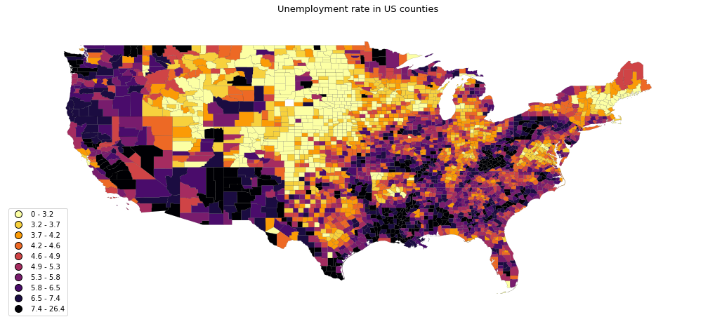
Figure: https://python-graph-gallery.com/choropleth-map-geopandas-python/
A choropleth map is a visualization method to demonstrate geographic regions wherein areas are shaded or patterned corresponding with the respective values of a variable being represented. It is a very effective visualization method to show the data that including geographic information.
Geoplot library can be used to create choropleth maps in Python.
11- Word Cloud

Figure: https://online.hbs.edu/PublishingImages/hbs-online-word-cloud.jpg
Word clouds, also known as text or tag clouds are a visual representation technique of text data in a dataset. In the visualization, a specific text enlarges by its frequency in the dataset. Word clouds provide a very quick and appealing overview of the main topics in the dataset. However, it has some drawbacks including a lack of context and missing out on the residuals because of its methodology.
This documentation provides a complete process of producing word clouds in Python.
Conclusion
There are many different data visualization techniques beyond the ones that are mentioned in this article. Each is suited for particular datasets and different purposes. Before concluding, it is prudent to emphasize the necessity of tailoring visual representations to the intended audience. Also, clearing the clutter, and unnecessary data and using the colors in the visualization in an accurate way enhances the audience’s comprehension and interpretation of the data.
Orphex provides importing your cookieless data and creates several dashboards to interpret your data accurately. It also offers different visualization techniques that are suitable for your data.
